Let me walk you through a UX case study where I redesigned a legacy telecommunication platform that had multiple individual applications for sales, monitoring, availability checks, and capacity management, rationalizing them into one unified platform.
Role
UX/UI Designer
Industry
Telecommunication
Duration
2.5 Years
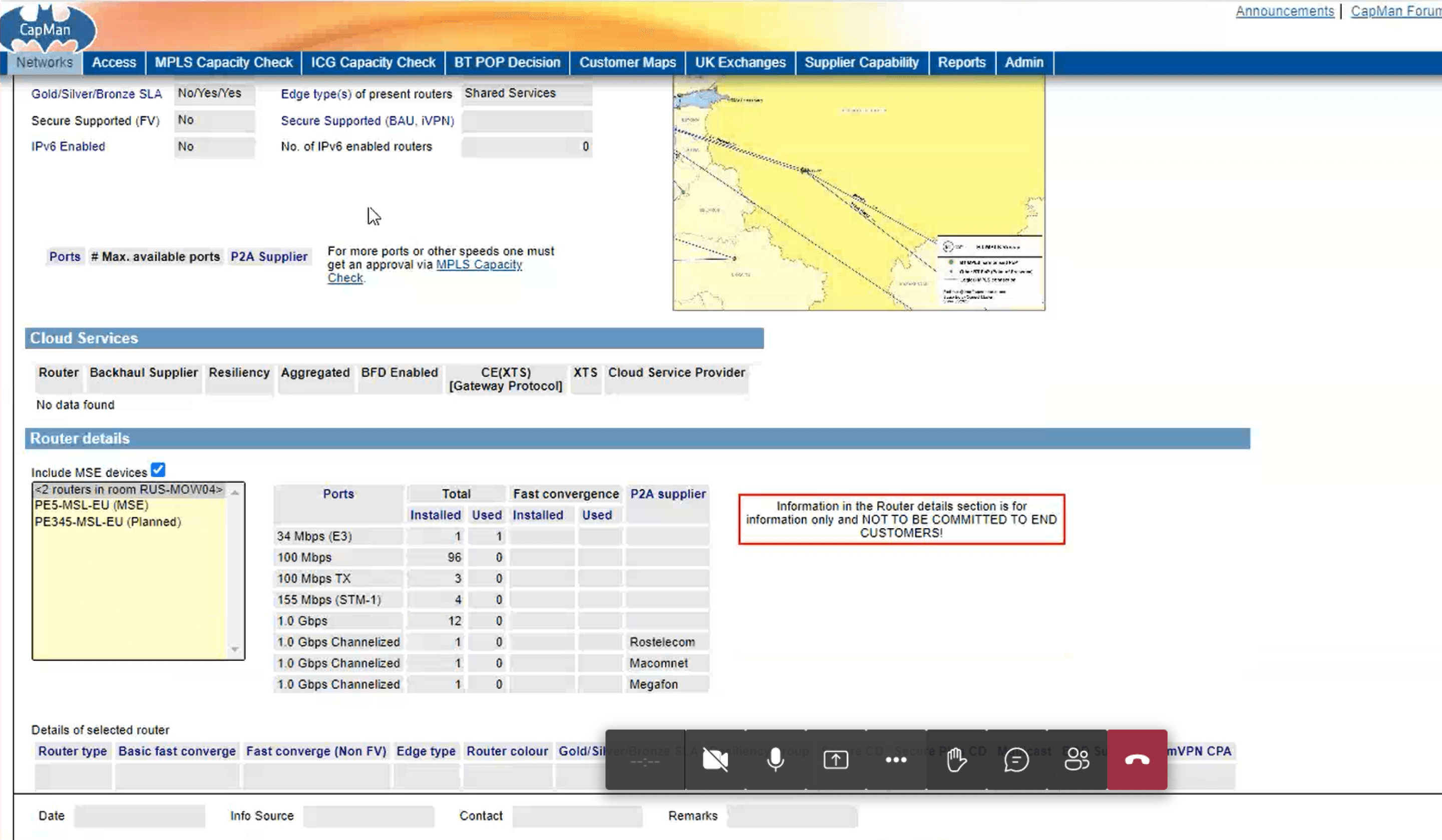
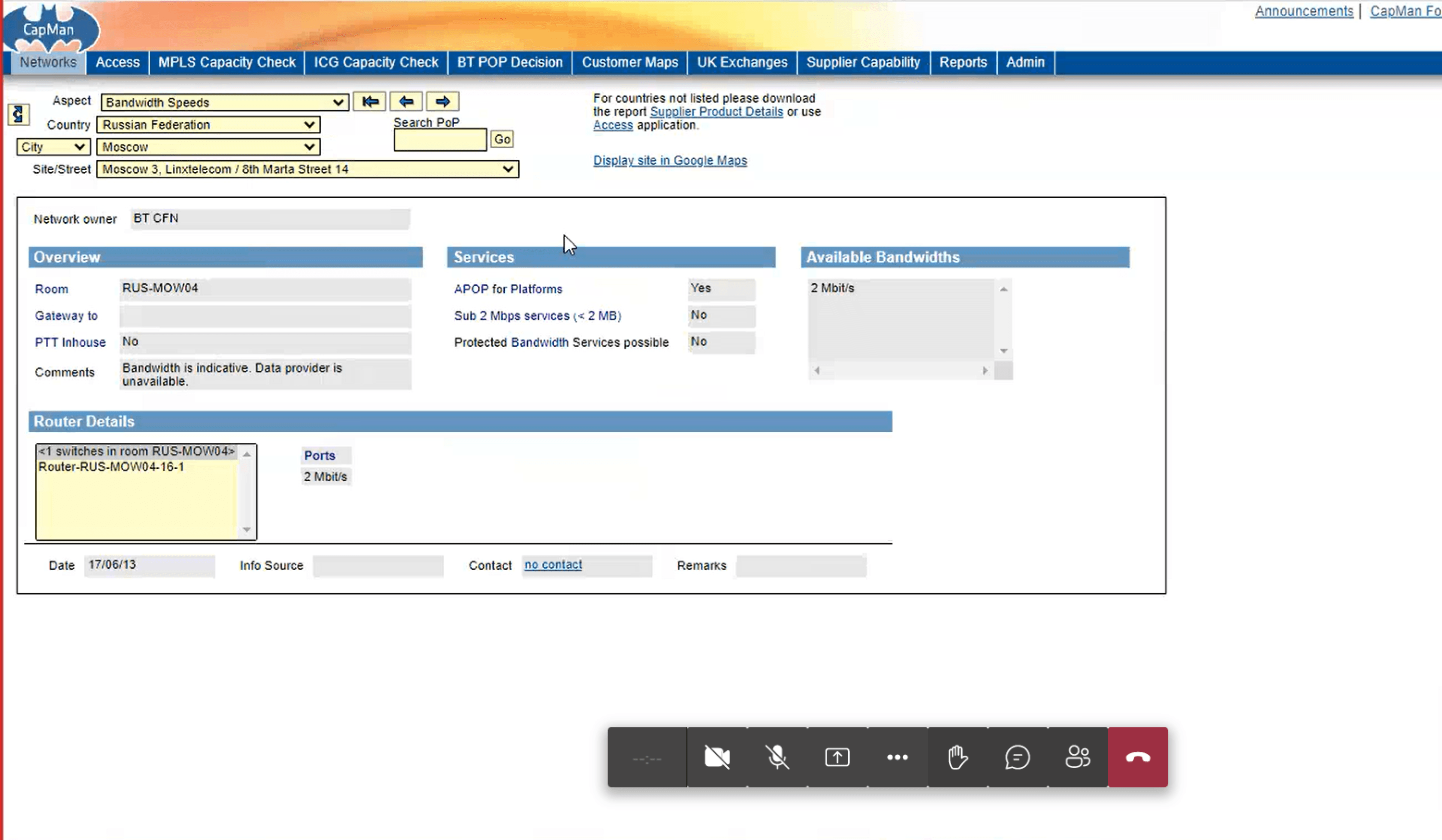
The project was to redesign a legacy telecommunication platform used by internal teams. The system comprised multiple disjointed applications for sales, network monitoring, availability checks, and capacity management. These apps were built at different times, had inconsistent user experiences, and lacked integration, which led to inefficiencies and frustration for users.
Team Composition
UI/UX Designers, Front-end Developers, Back-end Developers, QA Engineers, Product Managers
Technologies Used
Angular, Custom Design System, HTML, CSS, JavaScript
Consolidation
Integrate multiple legacy applications into a single, cohesive platform.
Efficiency Improvement
Streamline workflows and improve user experience.
Functionality Preservation
Ensure no loss of existing features during the transition.
Design System Integration
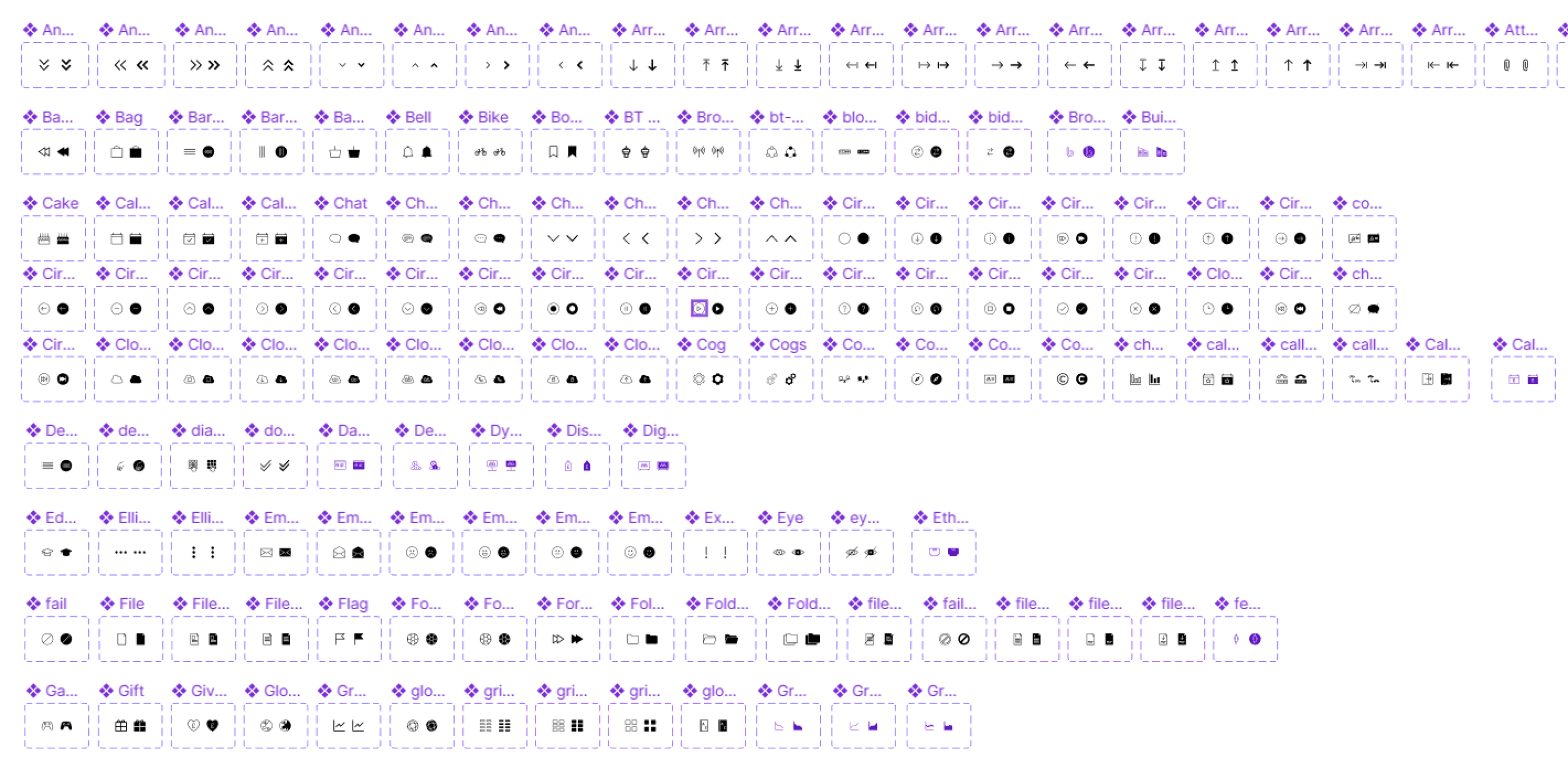
Utilize our custom design system to maintain consistency.
Modernization
Upgrade the user interface to align with contemporary design standards.
Designed a comprehensive dashboard for the Global Sales Tool, featuring real-time analytical data to provide actionable insights and streamline decision-making processes. The user-friendly interface ensures easy navigation and quick access to critical sales metrics and performance indicators.

Research and Analysis
To get a deep understanding of the users’ needs and pain points, I conducted:
User Interviews: I interviewed sales teams, network engineers, and capacity planners to understand how they interacted with the current system and what their pain points were.
Contextual Inquiry: I observed users as they performed their tasks in real time, noting where friction occurred and where the system slowed them down.
Heuristic Evaluation: I performed a heuristic evaluation of the legacy system to assess usability issues like inconsistency, cognitive overload, and navigation complexity.
Key Findings
Navigation Overload: Users had to navigate between four different systems, each with its own login, structure, and navigation paradigm, making it difficult to locate key information quickly.
Data Duplication: Users frequently had to re-enter data across different systems, resulting in manual errors and wasted time.
Lack of Integration: The sales app didn't communicate with the monitoring app, leading to delays in understanding the network's capacity when closing deals.
Inconsistent UI: The user interfaces across the applications were inconsistent, leading to a steep learning curve for new users and confusion for experienced ones.
Ideation:
Based on the research, the primary design objective was to streamline workflows by creating a single, unified platform. I collaborated with the product team to define the core features that would need to be integrated into the new platform.
Key Design Decisions:
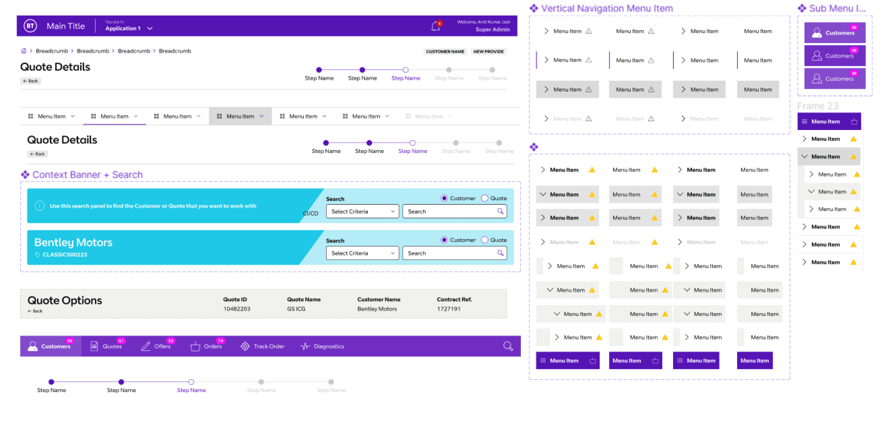
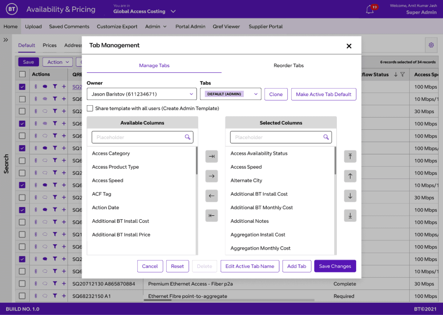
Centralized Dashboard: I designed a centralized dashboard that provided an overview of sales, network monitoring, availability, and capacity metrics in one place. This was the hub from which users could access detailed modules without switching between applications.
Unified Navigation: I created a global navigation system that allowed users to easily switch between tasks (e.g., sales, monitoring) while maintaining context.
Cross-System Data Integration: To eliminate data duplication, we integrated APIs that allowed real-time data flow between the previously separated systems. For example, sales data automatically linked to network capacity, ensuring real-time checks during the sales process.
Consistent UI Patterns: I established a design system with consistent UI components (buttons, forms, tables) across all modules, reducing the learning curve and increasing familiarity.
Wireframes and Prototyping:
I created low-fidelity wireframes to outline the general structure and flow of the new platform. These wireframes were tested in early usability sessions to validate the concept with key users.
After refining the wireframes, I moved on to creating high-fidelity prototypes using Figma. The prototypes allowed users to interact with the redesigned platform and experience the streamlined workflows.
Usability Testing:
I conducted usability testing with real users from each functional team (sales, monitoring, capacity management). The feedback gathered was instrumental in iterating the design. We improved elements like navigation clarity and simplified some complex data visualizations to make them more accessible to non-technical users.
Throughout the project, I worked closely with cross-functional teams:
Product Managers: Helped define business priorities and ensured alignment with organizational goals.
Developers: Collaborated with the development team to ensure that design feasibility and performance considerations were addressed early in the process.
Stakeholders: I regularly presented prototypes to stakeholders for feedback and alignment, ensuring the design addressed both business and user needs.
As the project progressed, several iterations were made based on usability feedback and technical constraints. For example, the initial design of the dashboard was too data-heavy for sales teams, so we simplified it by focusing on key metrics and allowing deeper insights through drill-down options.


The unified platform significantly improved user experience and business efficiency:
Quantitative Results:
Time Savings: Users reported a 35% reduction in task completion time, as they no longer had to switch between multiple applications and re-enter data.
Error Reduction: The integration of real-time data across systems reduced data entry errors by 20%.
Increased User Adoption: The consistent UI and simplified workflows led to a 40% increase in user satisfaction and faster onboarding for new employees.
Qualitative Feedback:
Sales Teams appreciated the direct access to network capacity data during the sales process, which helped them close deals faster.
Network Engineers found that the new monitoring module allowed them to track issues more effectively without needing to cross-reference between applications.
Early User Involvement: Engaging users early in the research phase helped uncover deep-rooted pain points that might not have been obvious otherwise.
Iterative Design: Continuous usability testing and iteration helped refine the design, ensuring it met user needs and business goals.
Integration Over Complexity: Consolidating multiple applications into a single platform increased productivity by reducing redundancy and simplifying navigation.
In the future, I would look into adding even more automation features, such as predictive analytics, to further improve decision-making for sales and network management teams.